An organic brand refreshed for deeper customer alignment.
With facilities located on the North Atlantic shores of Nova Scotia, Reef Organic has a vision to grow organic, craft cannabis with the lightest environmental footprint possible. As one of the only organic producers in the Canadian cannabis market, they enjoyed outsized success early on. Over the next few years competition flooded the industry and their market share fell significantly.
In the spring of 2021 the CEO engaged us to conduct our proprietary Brand Gap Analysis and identify areas of growth that could help them regain market share, increase revenues, and open up new markets. Working with their internal teams we developed a full integrated brand and positioning strategy, paired with a refreshed brand identity and narrative that reinvigorated that team and helped create a significant lift in sales and new market expansions.
-
Brand Gap Analysis
Brand Strategy + Positioning
Brand Identity System
Custom Brand Illustrations
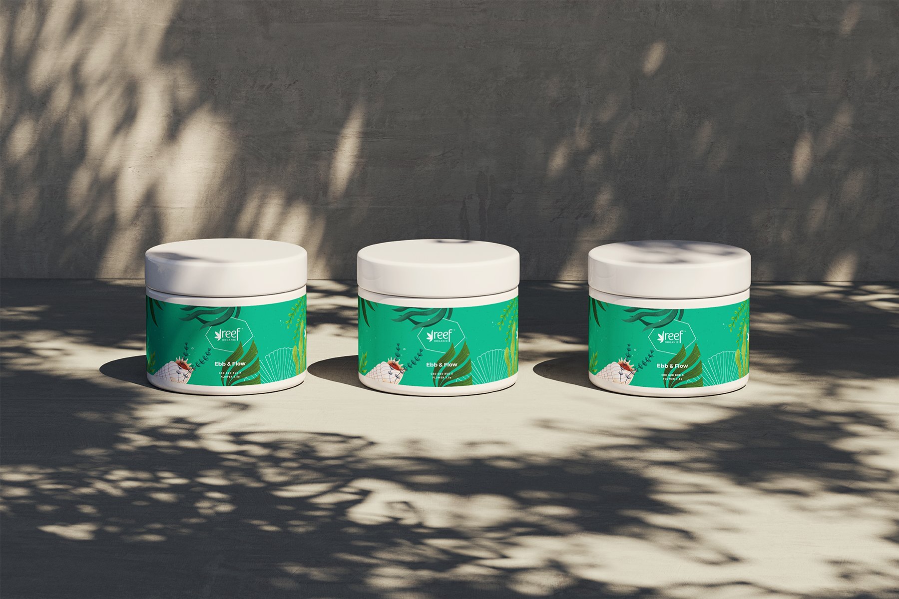
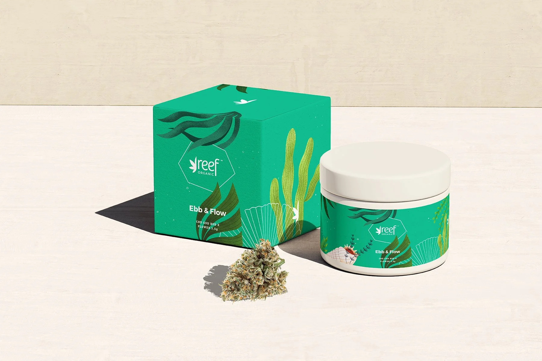
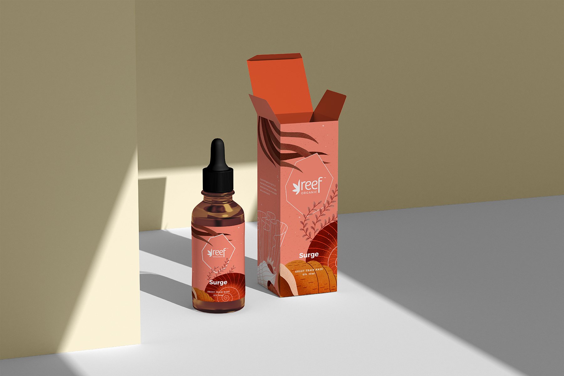
Product Packaging + Labels
Web Design + Development
Retail + POS Displays
Budtender Activation Kits
Tradeshow Booth + Event Materials
Branded Merchandise
-
STRATEGY + POSITIONING: Rachel Colic
DESIGN: Benny Corrigan, David Sacha
COPYWRITING: Paul Silbiger
-
Through our comprehensive analysis of the market, and facilitated interviews with consumers, retailers and industry stakeholders we discovered that; 50% of cannabis shoppers express a preference for organic products, and 86% of millennials were willing to pay more for organically produced products. We also identified that only a small percentage of customers and retailers were aware of Reef Organic’s unique aquaponic production methods, their compostable packaging, or their commitment to building a diverse, inclusive company. These core values and brand attributes were repeatedly reported as highly valuable and important by the customers we surveyed, but were lacking in Reef’s current brand identity, positioning and storytelling.
Collaborating with their internal teams we identified a clear target customer – the discerning conscious consumer whose keen to know how their cannabis is grown and what goes into the products they buy. Our team then developed a fully refreshed brand identity and positioning strategy that reflects the brand's connection to the East Coast Canadian spirit and showcases their deep commitment to growing exceptional cannabis while building a sustainable future for all.
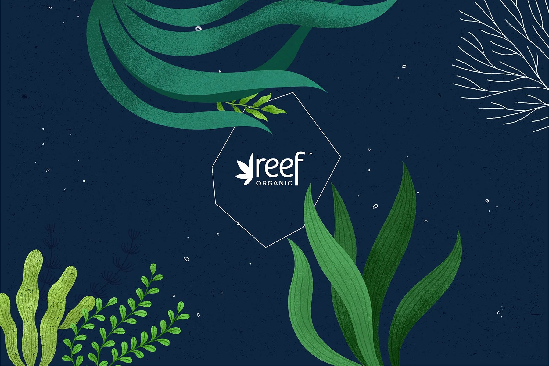
The Reef Organic name was originally inspired by the coral reefs that acts as the medicine chests of the sea; offering habitat to marine life, buffer shorelines, and contributing to producing the oxygen we all need to thrive. The refreshed brand identity doubles down on that inspiration through a series of custom illustrations that vividly depict a dynamic underwater landscape. Serving as an eye-catching representation of the oceanways they aim to protect, while creating a whimsical and highly recognizable canvas for their packaging and promotional materials.
To enhance the overall aesthetic and create a cohesive visual language, each set of illustrations is carefully paired with a colour from the brand palette. This thoughtful approach adds a fresh and inviting feeling to the design, while also allowing for easy categorization of their product mix. The aquatic-inspired colour palette further strengthens the identity, tying together the visual elements and creating a cohesive and recognizable brand presence.
-
We relaunched the brand across existing markets with key retail activation campaigns successfully creating deeper brand awareness and affinity, a 40% lift in overall sales and expansion to five new provincial markets over the 12 months following the relaunch.
As interest and demand grows for environmentally friendly and socially conscious cannabis brands across the globe Reef Organic is well positioned in both substance and style to deliver on this demand with a lineup of sustainable, premium products that meet the standards of their discerning customers.