A plant wellness brand for the modern purist.
PureSinse is a licensed cannabis producer located in Brampton, Ontario created by a small group of ordinary people committed to doing something extraordinary. Healers and helpers, entrepreneurs and pharmacists, growers and innovators — all passionate about the potential cannabis holds as pure medicine, and a dynamic lifestyle enhancement.
When we were engaged by the PureSinse leadership team in the spring of 2018 they had selected the name but were lacking a brand identity, positioning and go-to-market strategy for the brand. To be ready for their official public launch they needed a fresh, approachable brand that positioned them as a trusted leader with both wellness enthusiasts and health care practitioners across the sector.
-
To ensure the brand was grounded in the company’s true culture and unique strengths we facilitated workshops with their internal teams, conducted community surveys and patient interviews, gathering key insights from stakeholders. Through this research we uncovered a gap in the market that aligned perfectly with the PureSinse vision for the future. Utilizing these insights we developed; a comprehensive brand strategy, strategic messaging, packaging designs and marketing collateral catering to the modern wellness enthusiast that seeks clean, pure ingredients and lives an active, eco-conscious lifestyle.
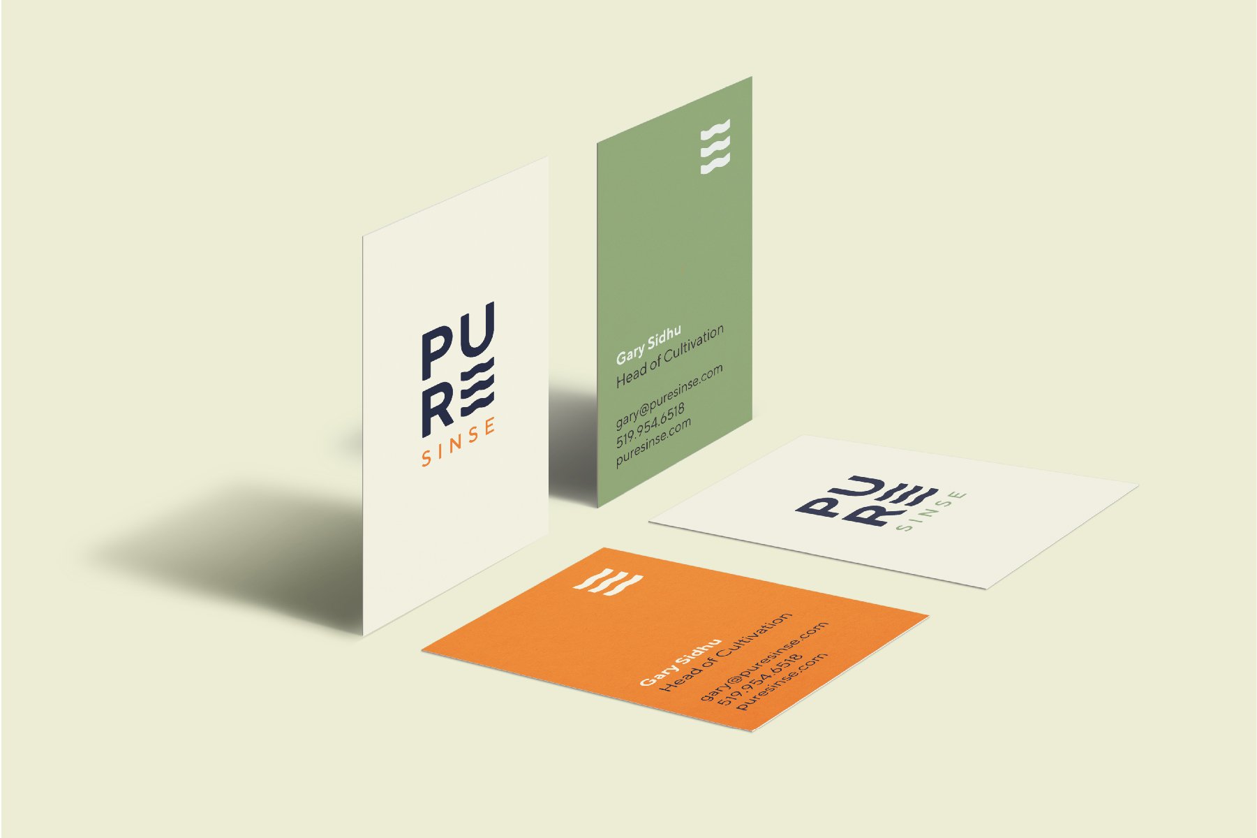
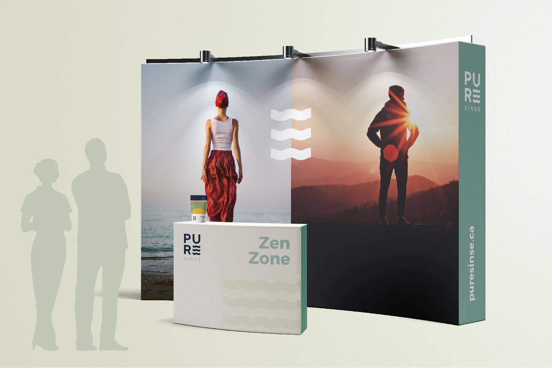
At the heart of the brand identity is the PureSinse logo mark distinct with three fluid waves held in deliberate harmony. The form is simple, yet symbolic representing movement, the natural elements of life and a subtle reference the brand’s proprietary cultivation method — a unique fusion of aeroponics and hydroponics where the plant thrives suspended in a precisely calibrated ecosystem.
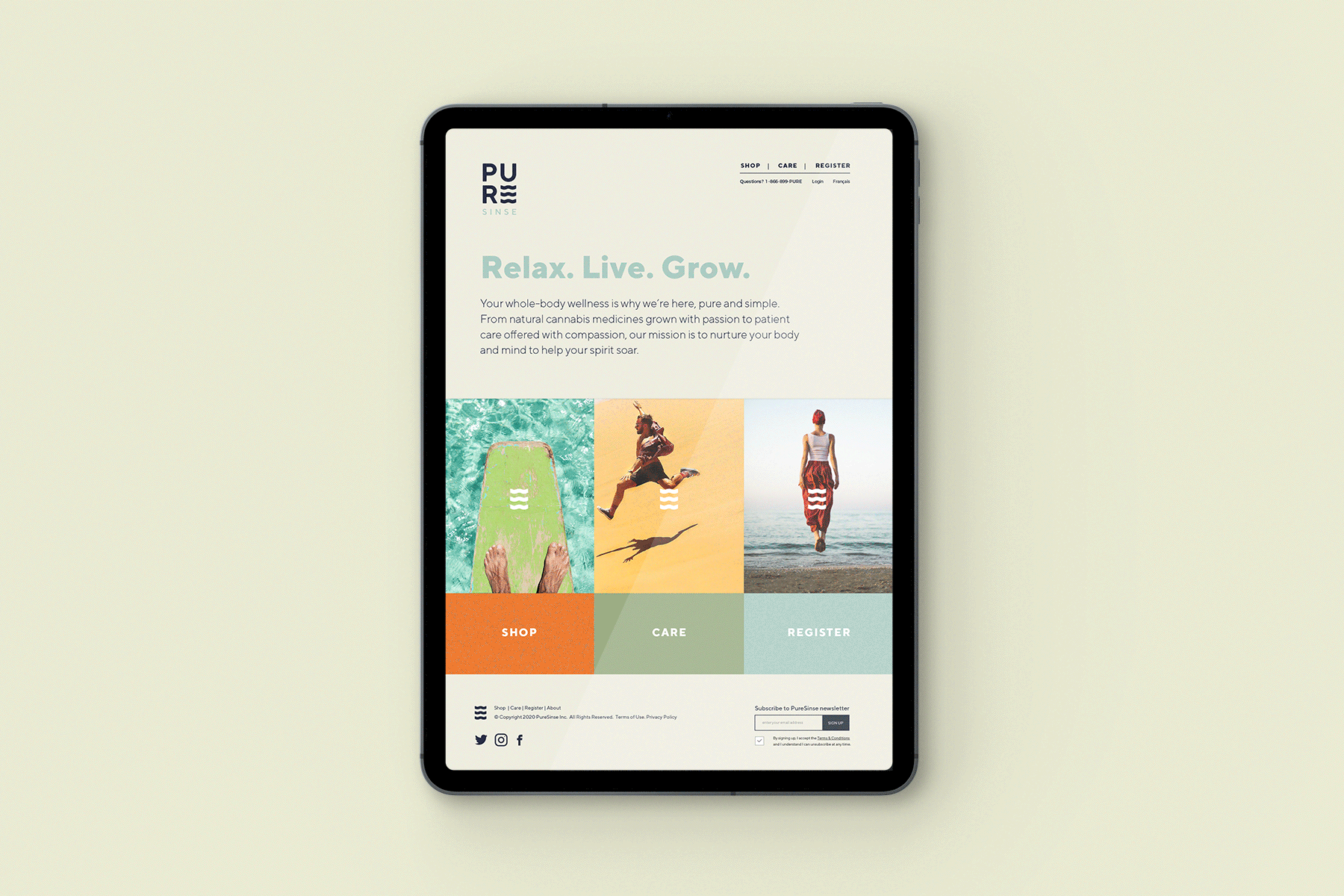
The colour palette is soft and natural, making it feel grounded and honest. Nothing is staged or overly polished. The photography extends this philosophy into lived experience. Rather than dramatizing the product, the brand imagery focuses on real, everyday individuals in unguarded, natural moments — walking in golden light, sharing conversation, pausing in reflection, laughing without performance. The tone is intimate but not intrusive, elevated but never aspirational to the point of fantasy. Cannabis is not the hero, an embodied life is. The result is a warm, inviting brand that acts as the quiet enabler — enhancing presence, and lifting the spirit just enough to allow each moment to feel purely at ease.
-
Together, the brand elements create a cohesive visual language that is both fluid yet structured. PureSinse doesn’t position cannabis as rebellion or indulgence. It acts as a thoughtful companion to whole-body wellness; integrated, intelligent, and deeply personal.
The PureSinse brand captures this unique essence ultimately expressing a simple but powerful idea: when nature and science move in pure balance, life flows better.
-
Brand Strategy + Positioning
Brand Identity Design
Product + GTM Strategy
Product Packaging Design
Marketing Collateral
Tradeshow + Event Activations
Web Design + Development
Branded Merchandise
-
STRATEGY + POSITIONING: Rachel Colic
DESIGN: Benny Corrigan, David Sacha
COPYWRITING: Paul Silbiger, Rachel Colic