A rebrand that creates ripples across the aquaculture industry.
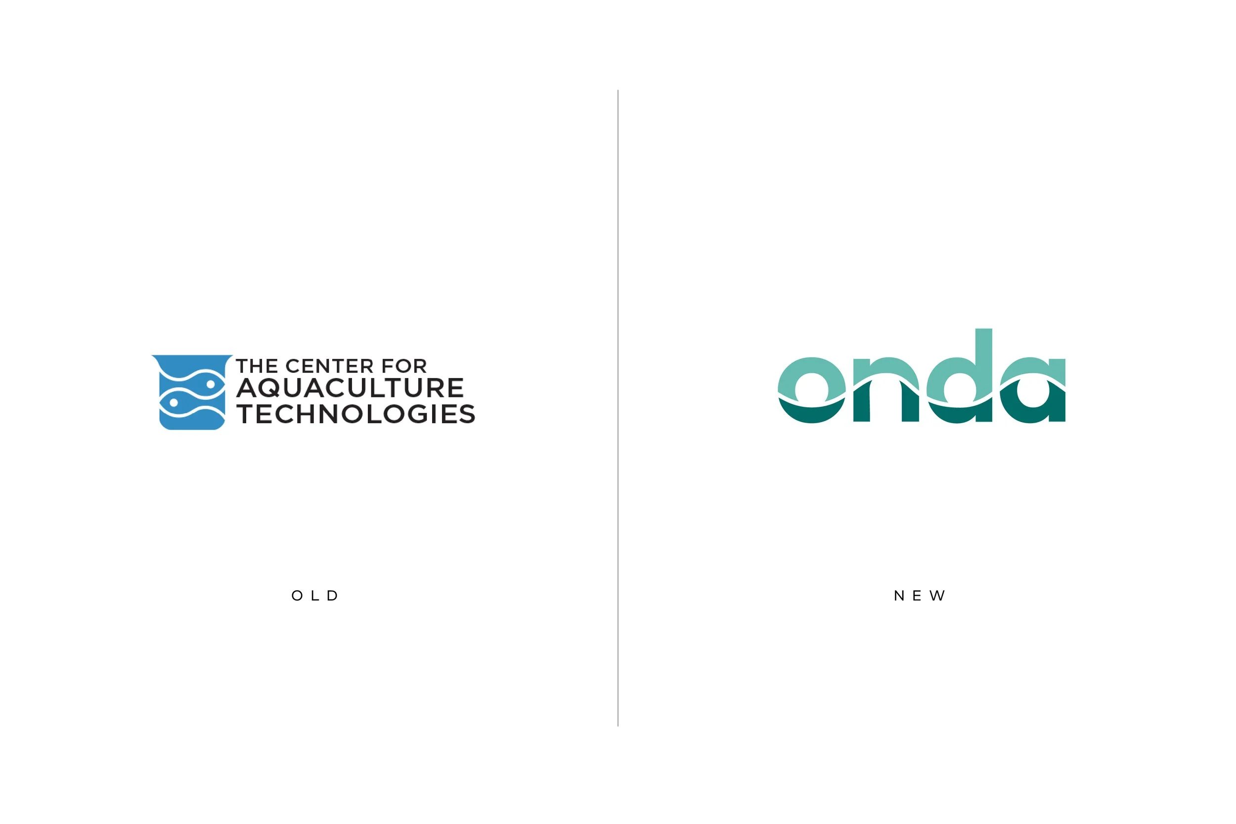
In the Spring of 2024, the Center for Aquaculture Technologies (CAT) an aquaculture research organization, and its Canadian subsidiary (CAT-C) embarked on a strategic realignment that would see both companies becoming independent entities with individual names. The US based entity was to retain the CAT brand, while the Board of Directors ventured to find the perfect name and brand story for the Canadian entity that would carry it into the future and catapult its growth.
Seeking a name and positioning strategy that would illustrate their values, inspire their teams, and create distinction within the category, they called on the YCREATIVE team – knowing our reputation for developing category defining brands.
-
Eager to launch at a major industry trade show happening in less than 90 days, we worked with their internal teams to execute an expedited Brand Gap Analysis, SWOT and competitive review, identifying key elements that serve as core emotional drivers for the brand. By engaging their senior leadership teams in our proprietary Brand Discovery Workshop we identified the brand’s core values and clarified the ideal target markets that could provide significant growth opportunities over the next year.
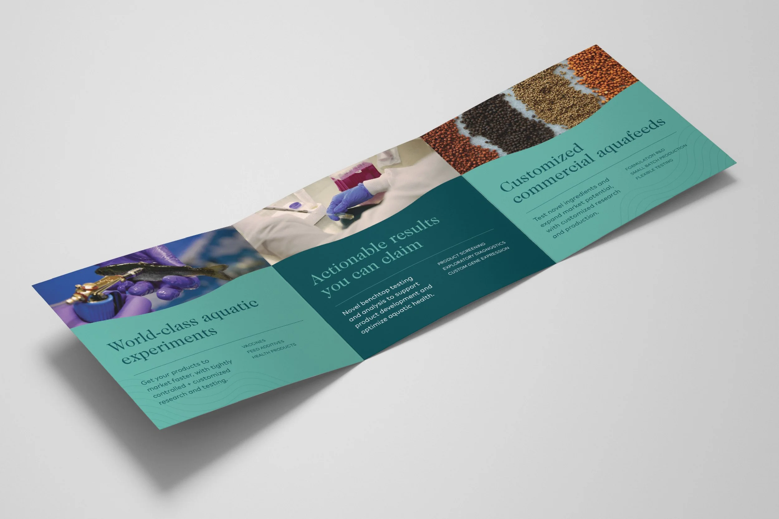
Utilizing these insights we built a comprehensive brand identity, positioning strategy, suite of brand expressions, launch campaign, and event materials that would captivate key stakeholders and potential clients at their upcoming event – and beyond. Our creative process began with developing a distinctive brand name and refreshed narrative that aligned with the company’s core values and vision. From a shortlist of six, a final name was selected by the Board and the Onda brand was born.
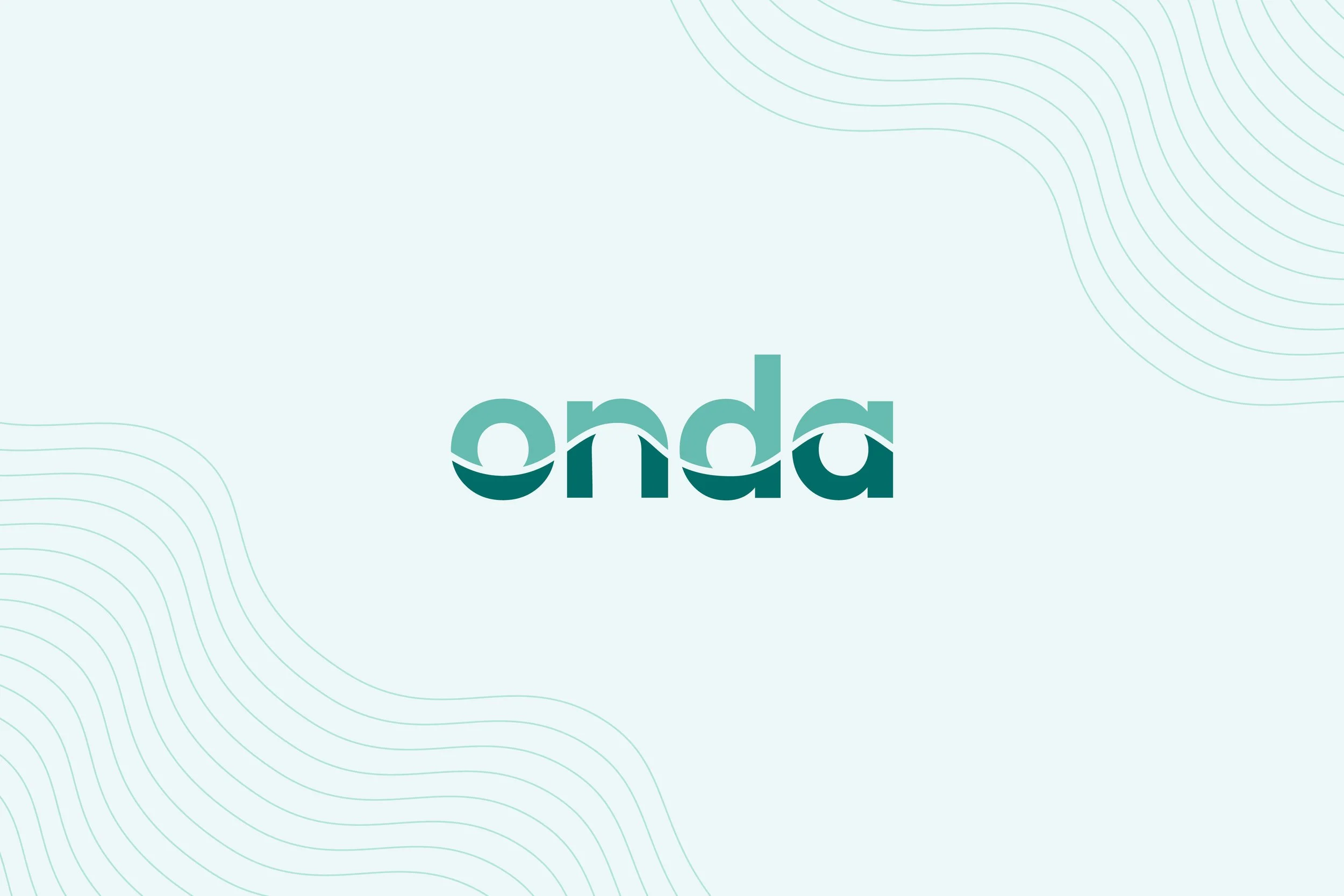
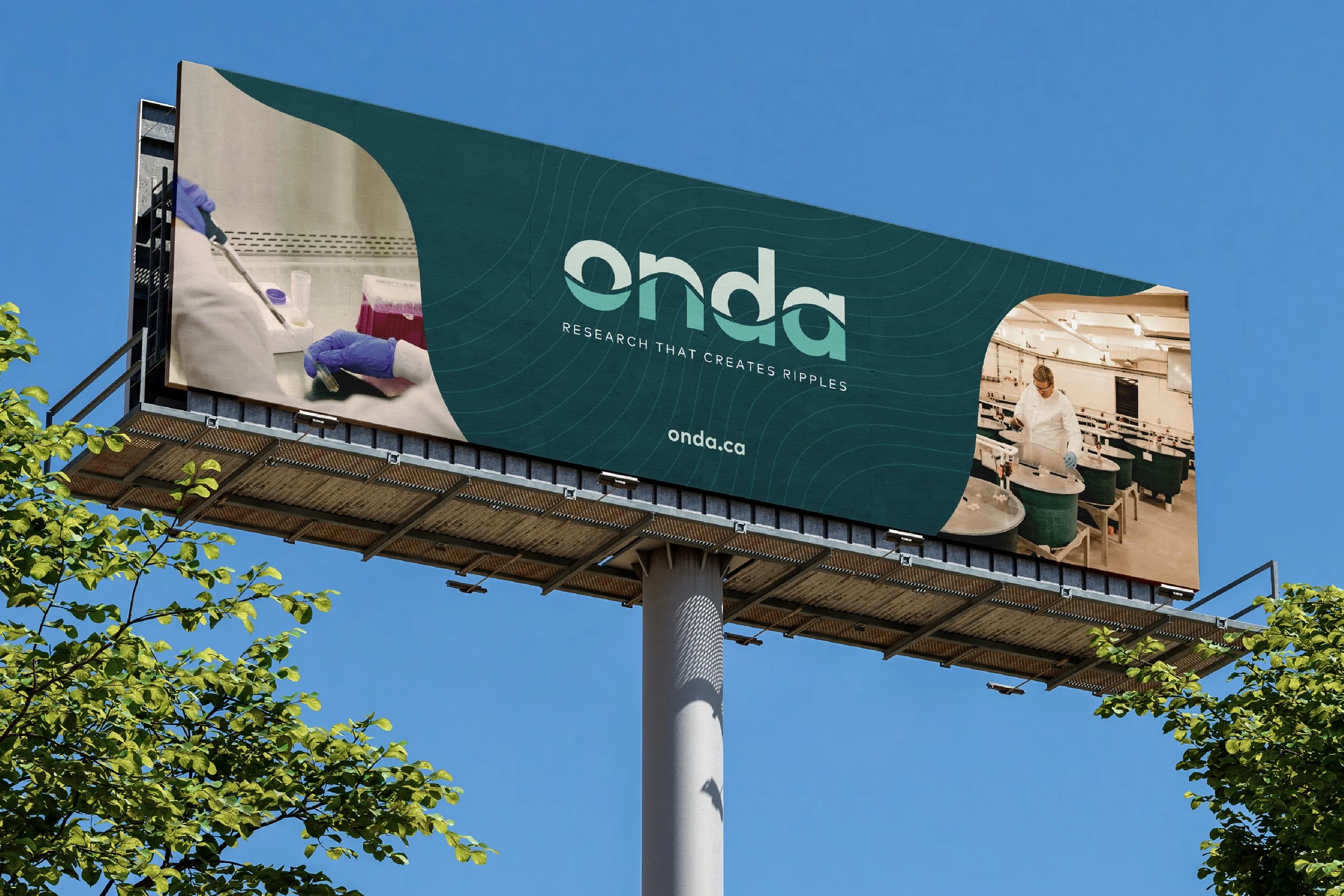
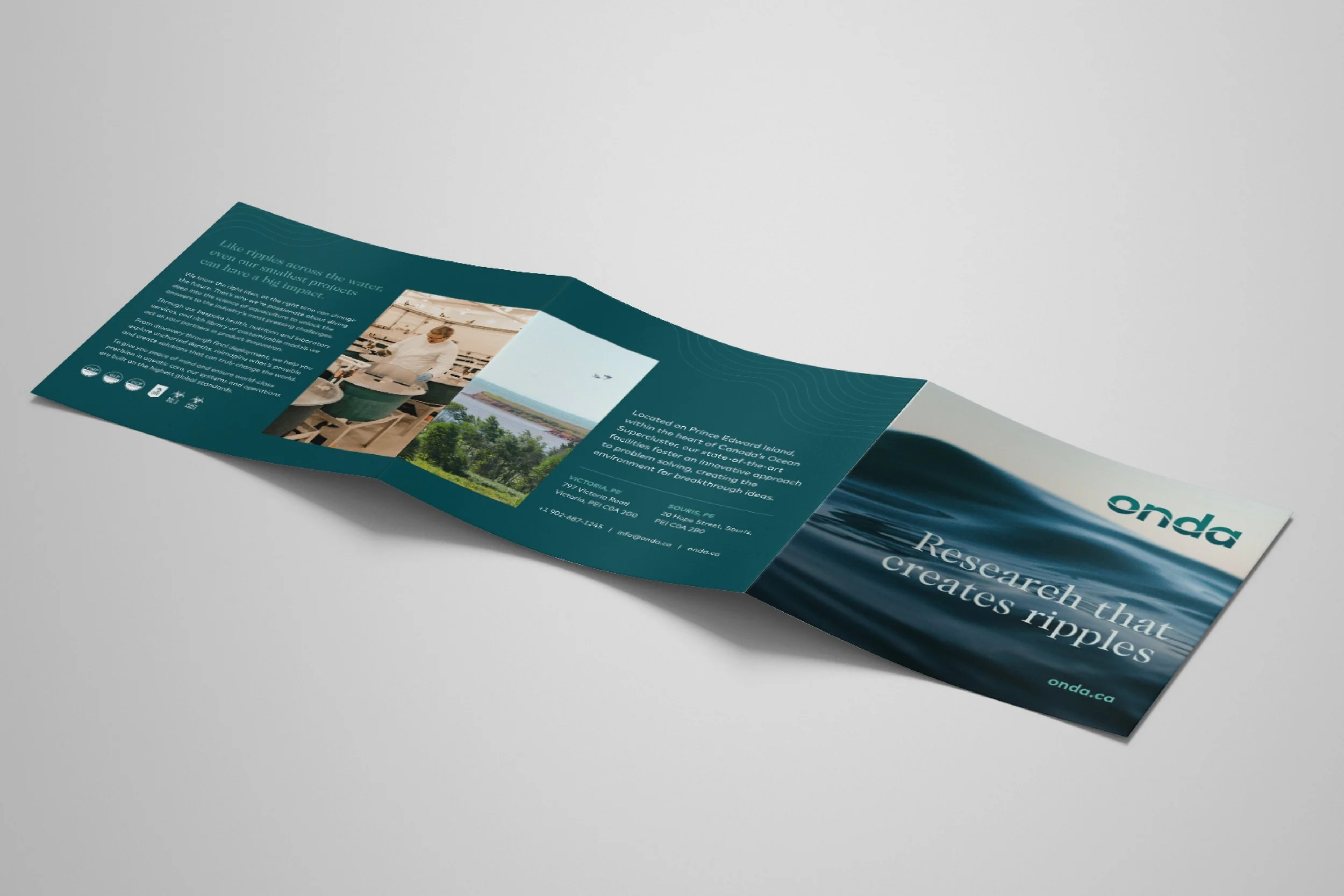
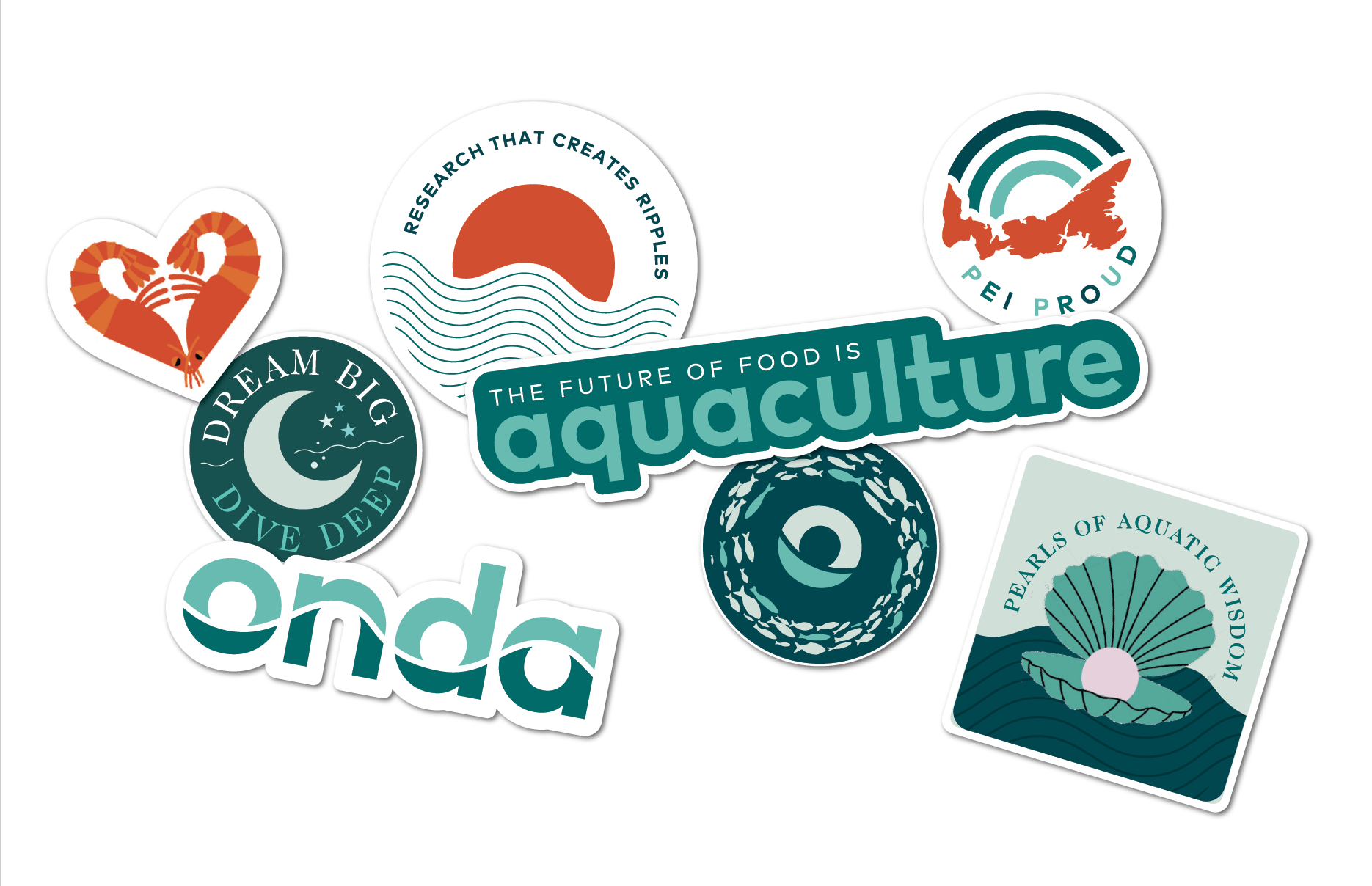
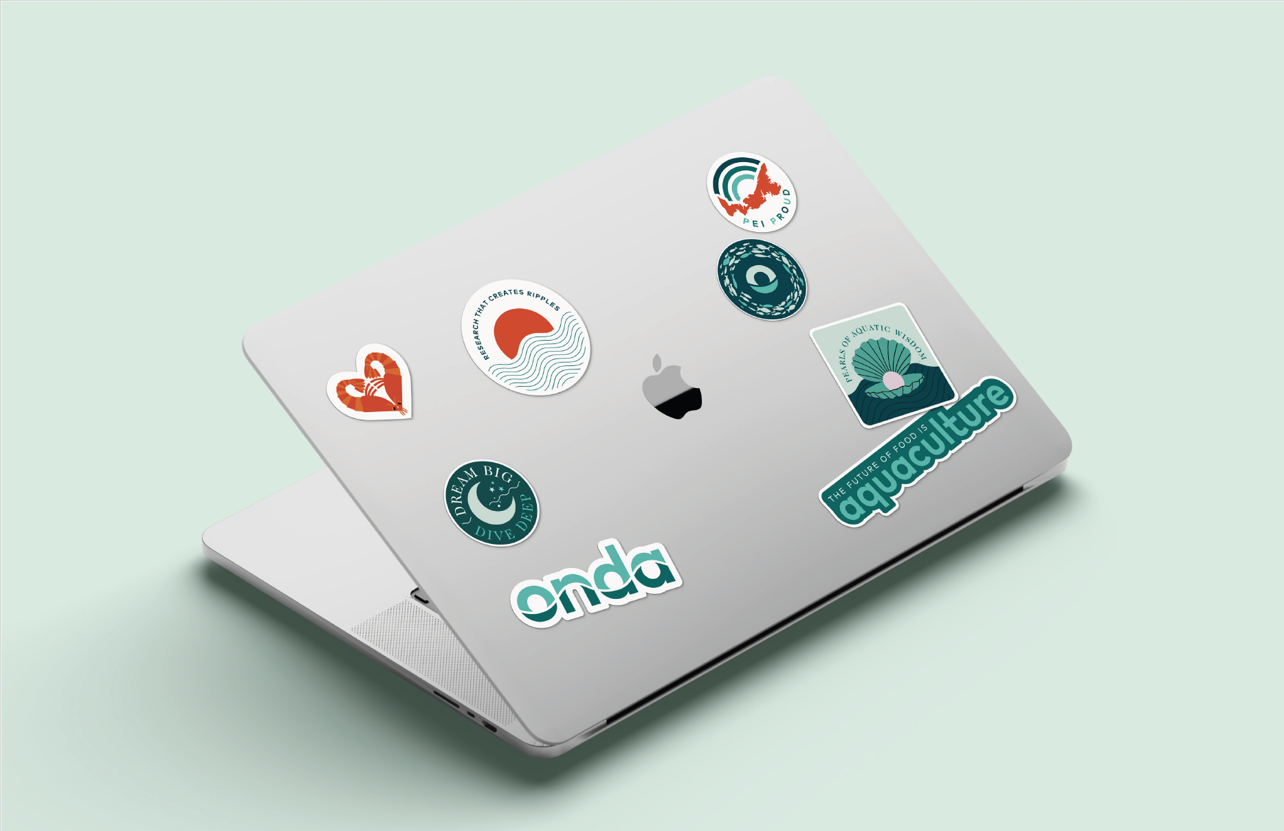
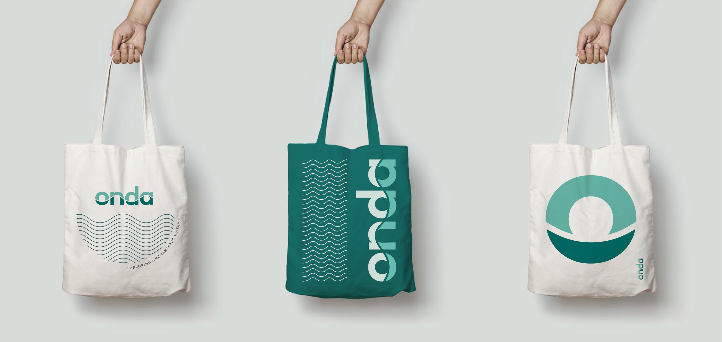
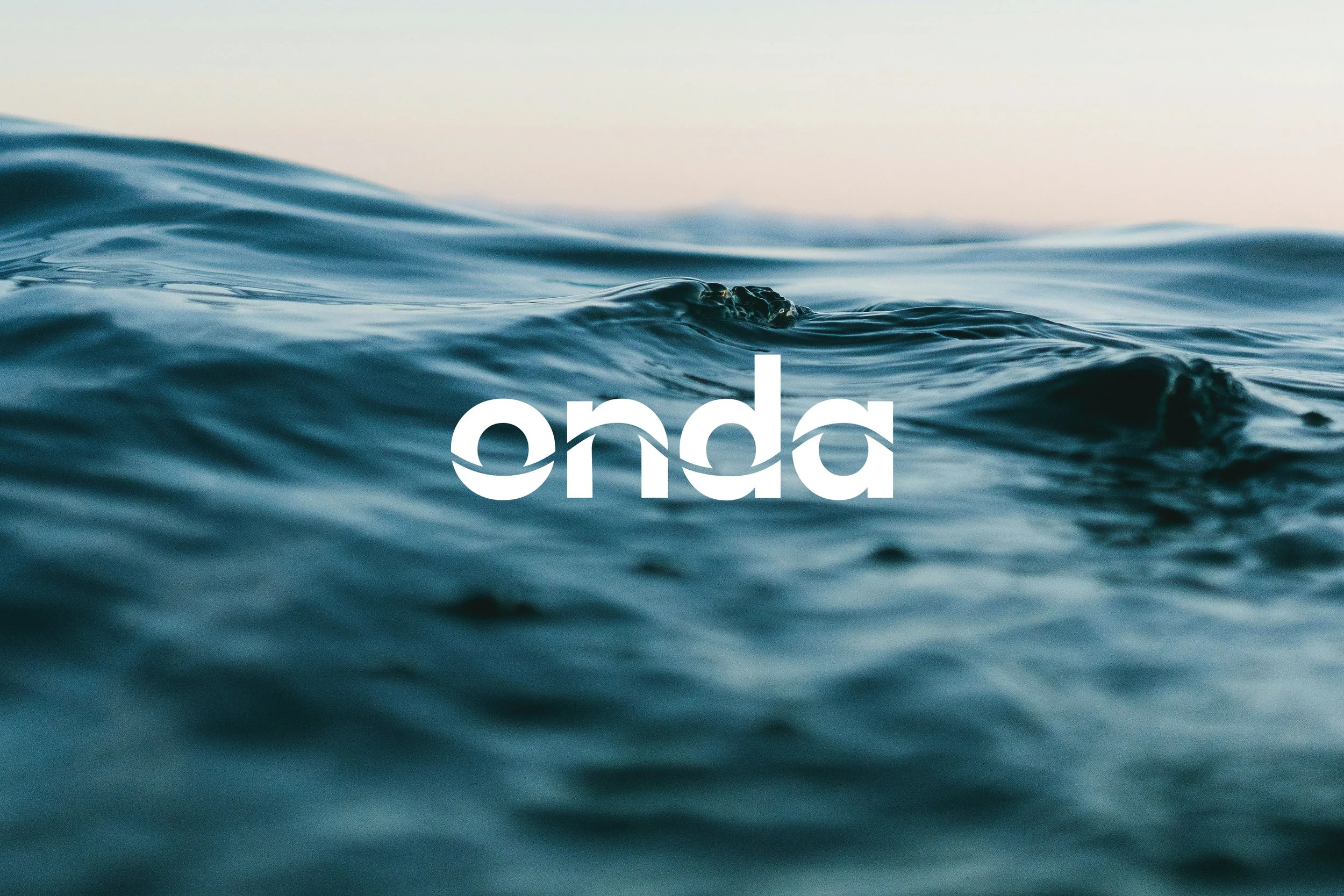
The word “onda” has many meanings across cultures and languages. In Latin, it represents a ripple or gentle wave in a body of water. In the Spanish-speaking world onda means vibrational waves, a state of mind, or being in frequency with a movement. Similarly, in Portuguese, onda can be used to describe cultural and environmental trends or movements. This varied and dynamic meaning perfectly encapsulates the companies’ mission to drive collaborative and sustainable research that creates positive ripple effects across the sector, establishing a new wave of industry excellence.
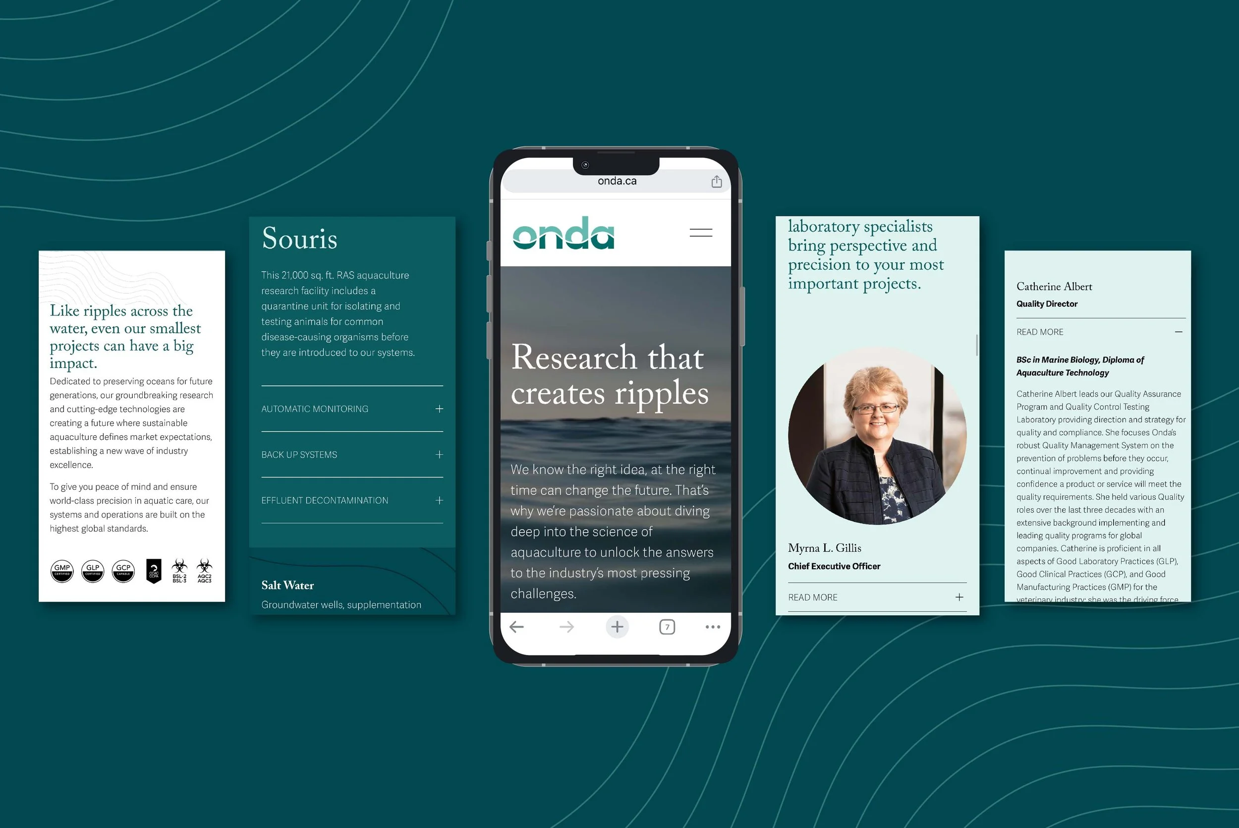
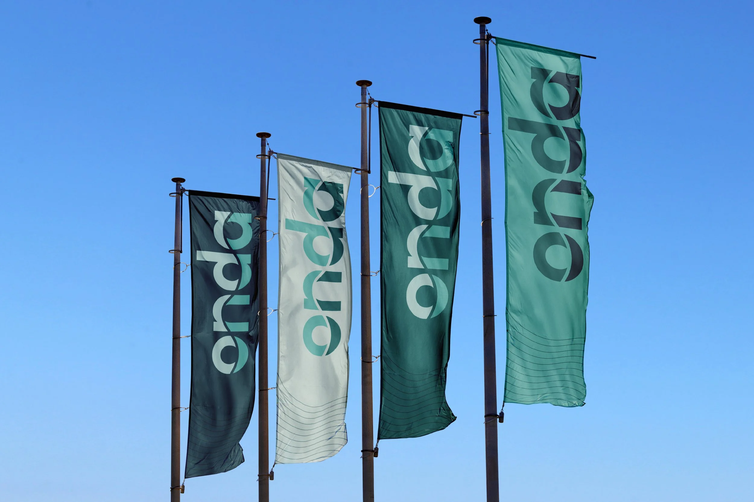
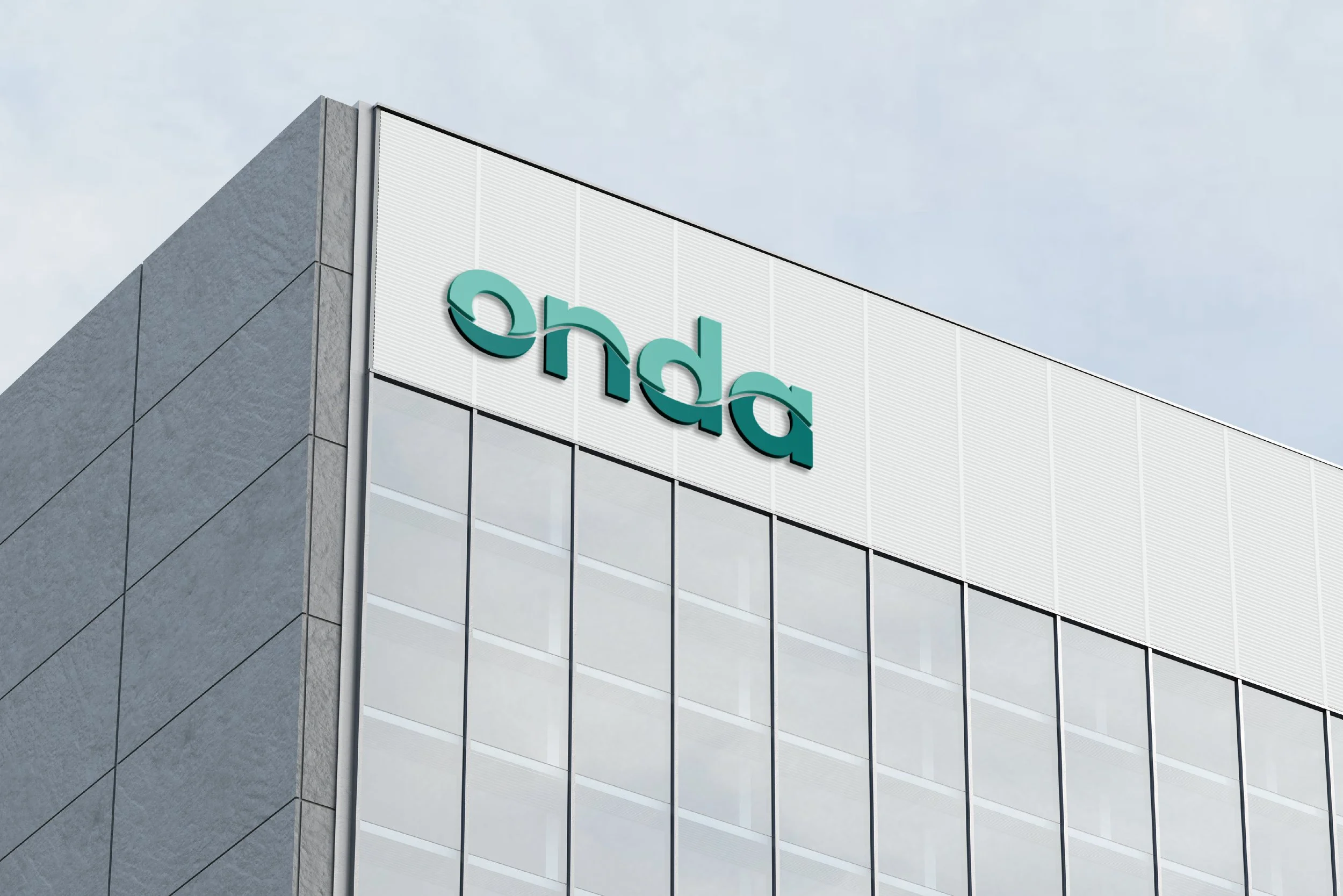
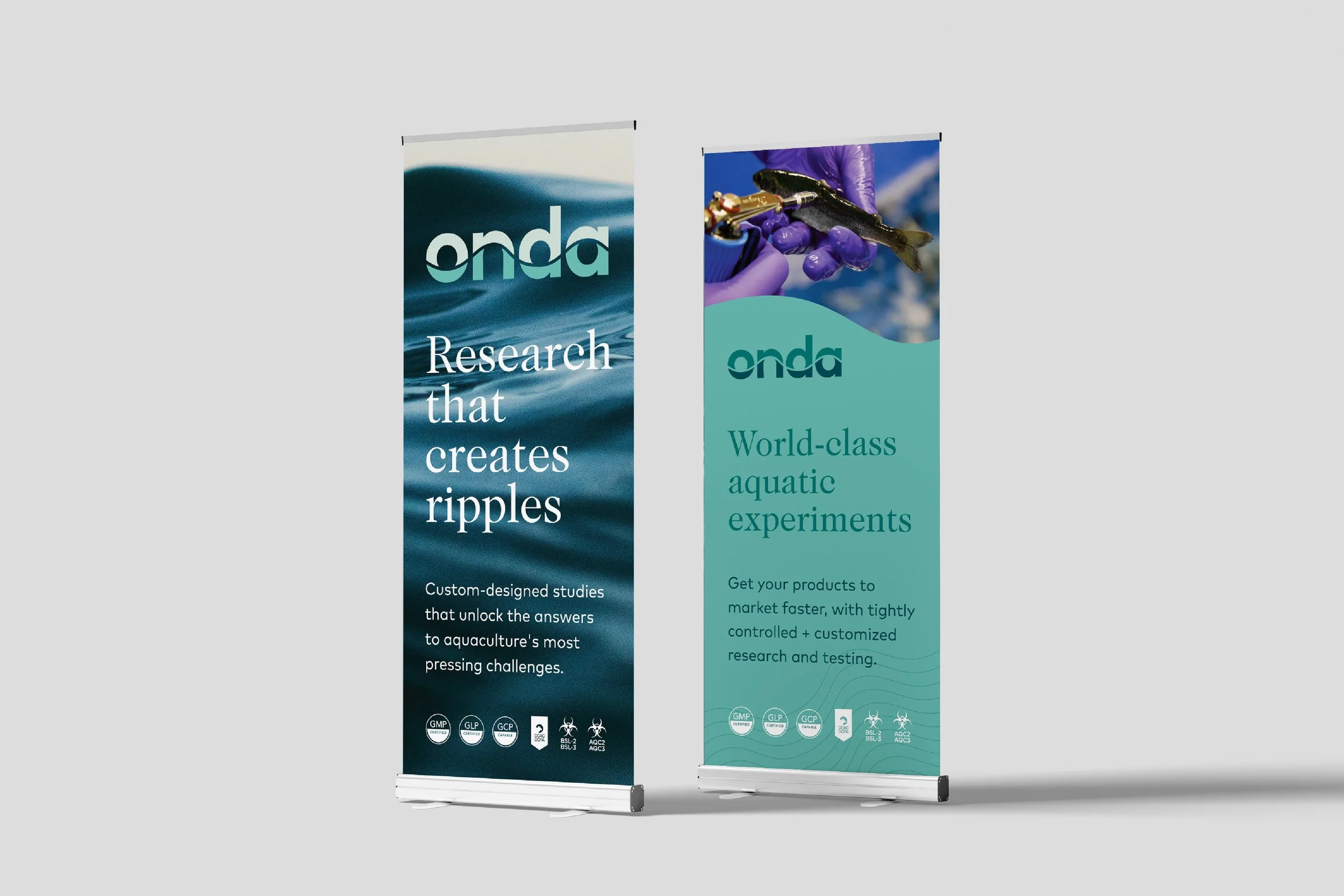
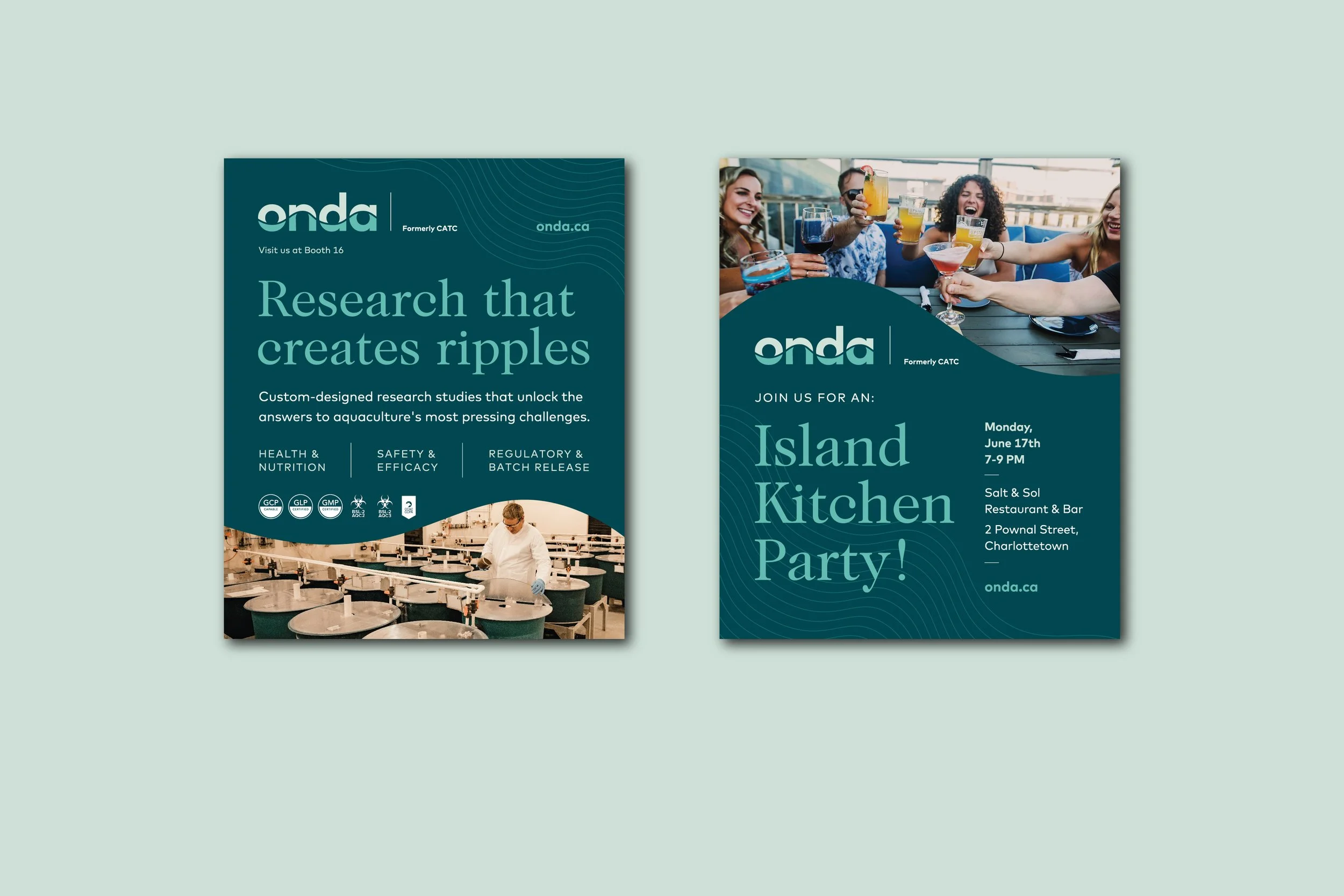
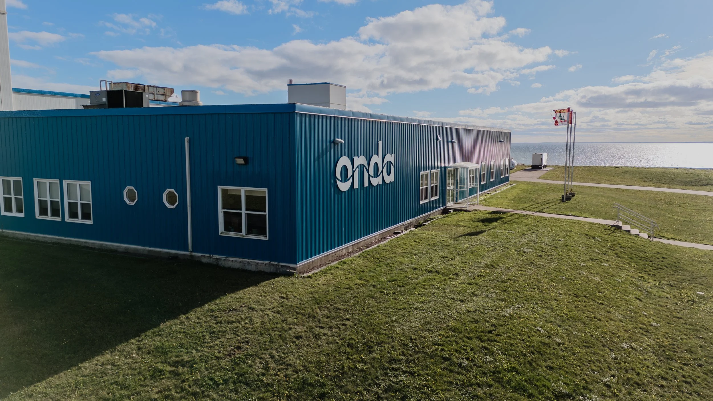
The new logo cleverly links the letter forms in the Onda name with a subtle wave form, symbolizing the dynamic nature of water and reflecting the company’s commitment to adaptability and innovation. A nod to the previous logo, this new design creates a subtle yet meaningful link between where they’ve been and where they’re going, maintaining a sense of familiarity for existing stakeholders while signalling a transition to a new identity. By echoing the motion depicted in the old logo, the new design pays homage to Onda’s history while paving the way for its future evolution. Like ripples across the water, even their smallest projects can have a big impact. This simple idea inspired a new tagline for the brand; ‘research that creates ripples’ which quickly became the flagship message embedding deep meaning into the brand that their community, clients and collaborators could easily understand and celebrate.
-
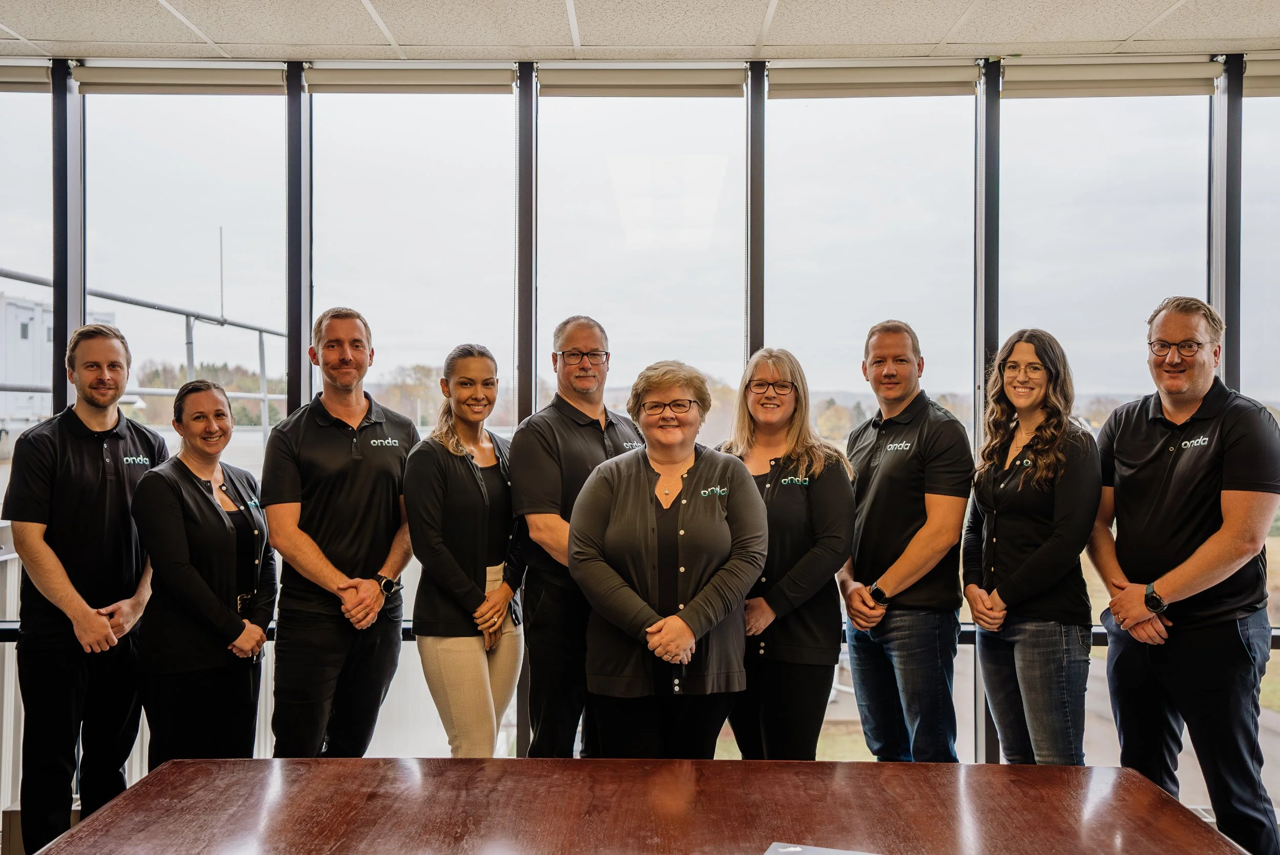
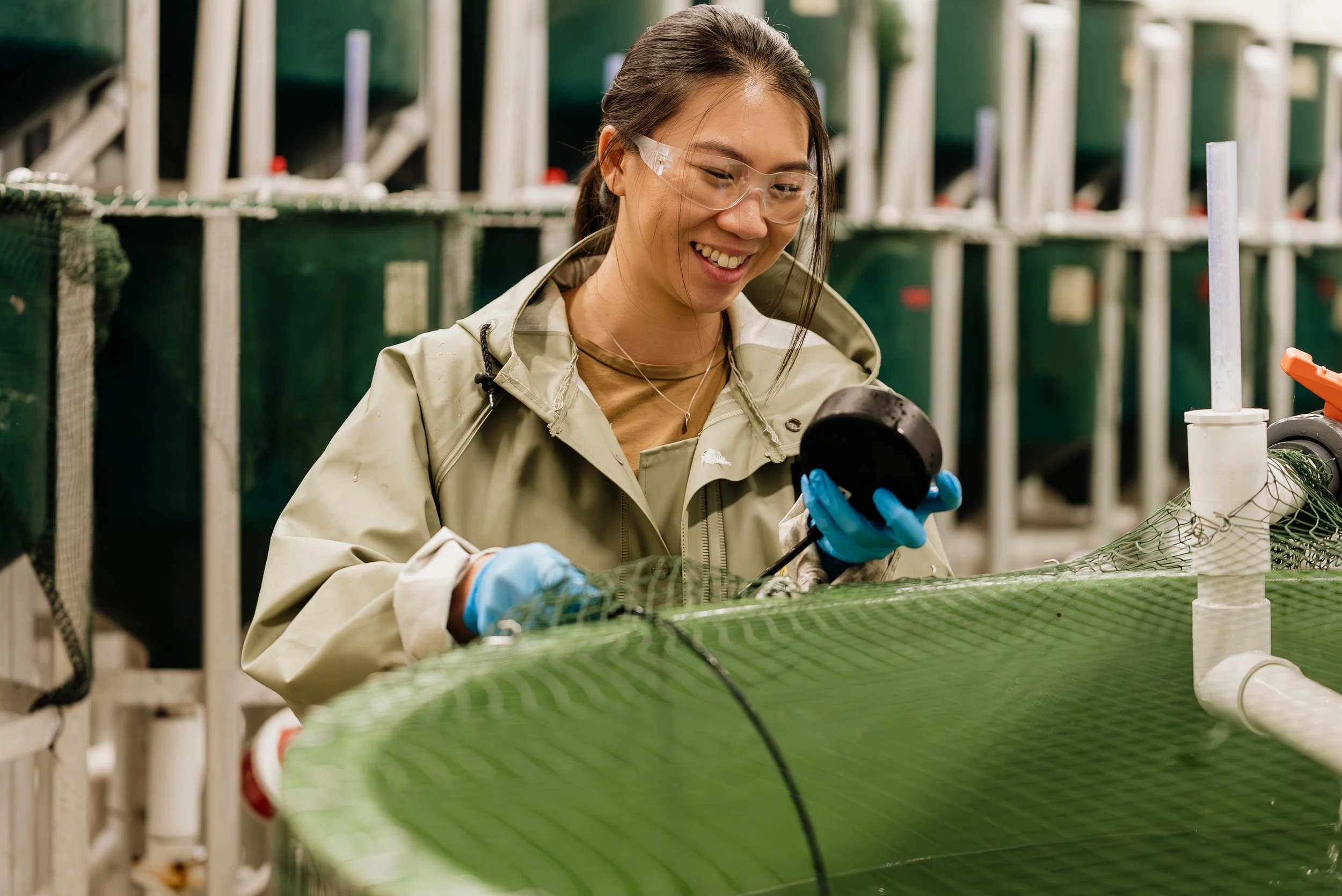
To ensure the business development teams were well versed on the vision and felt comfortable with the new brand messaging, we designed and delivered a Brand Ambassador training workshop. The workshop focused on reinforcing the meaning behind the Onda name, the value drivers that align with their ideal clients needs, and strategies for delivering an engaging elevator pitch during events. Collaborating with their internal marketing team, we planned a traditional East Coast casual-style Island Kitchen Party as a networking and social event to take place during the trade show. This provided a relaxed, social environment where they could engage with existing clients, new prospects and industry leaders to share their excitement about the new Onda brand and mission.
By selecting a unique, ownable name that has deep meaningful connections to their mission and vision, and pairing it with a clever logo and tagline, we successfully created a powerful brand that sets the company apart from their competition. The new brand name and identity has been exceptionally well received by both their internal teams and their external stakeholders, collaborators and clients. Many of their key clients and contacts have enthusiastically replied to the launch communications in celebration of the new name and the reinvigorated mission. Within the first 90 days after launch, their website traffic increased 280% over previous site traffic and the Onda social media profiles saw a 233% increase in engagement across platforms.
-
Brand Gap Analysis
Brand Strategy + Positioning
Brand Naming
Brand Identity Design
Corporate Communications
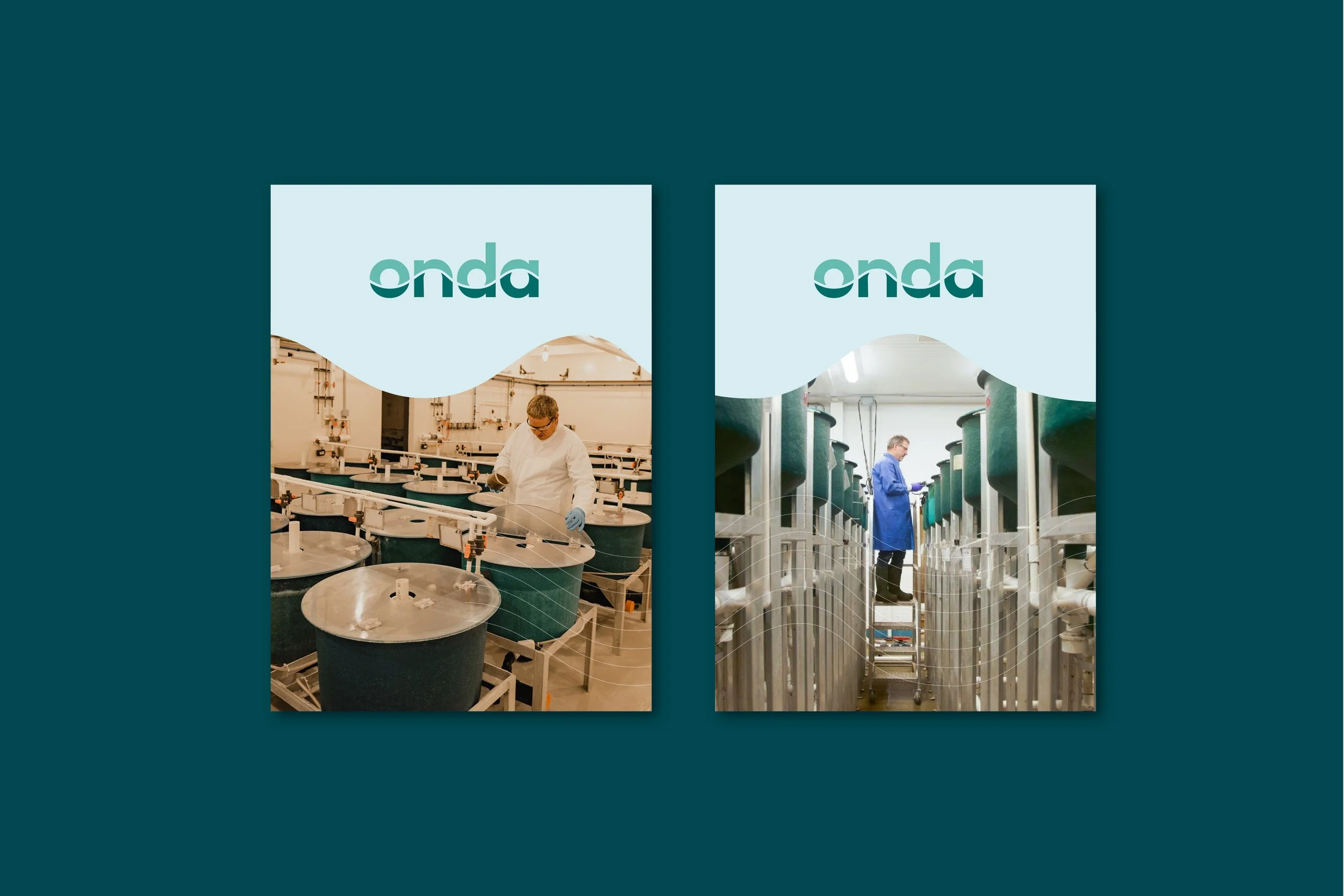
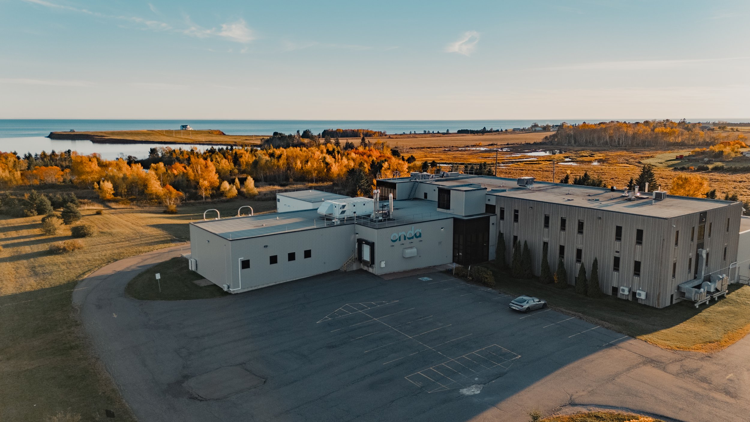
Facility Signage
Custom Brand Illustrations
Tradeshow Booth + Event Materials
Research Presentation Templates
Website Design + Development
Social Media Graphics
PR + Digital Advertising
Brand Ambassador Training
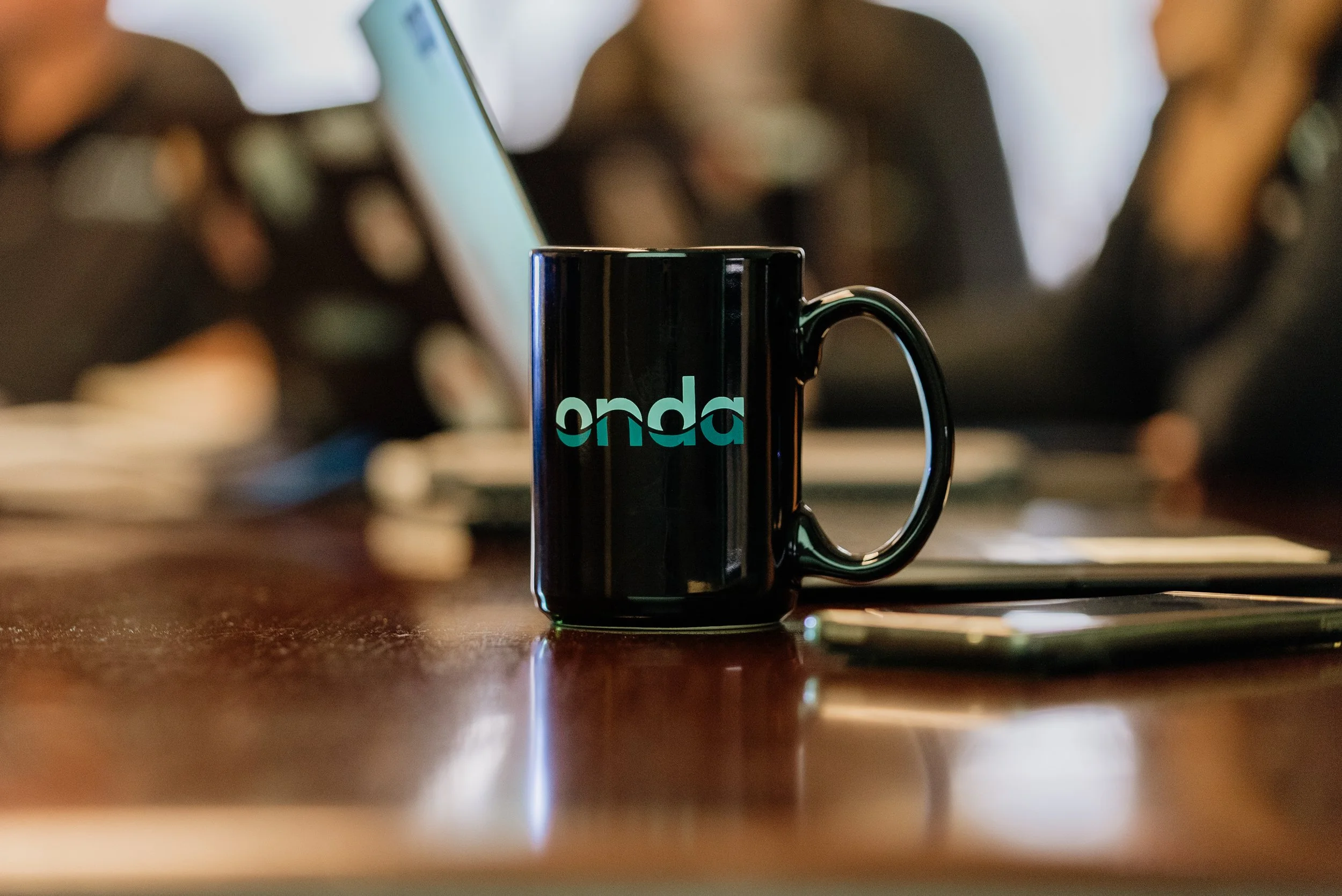
Branded Merchandise
-
STRATEGY + POSITIONING: Rachel Colic
DESIGN: Benny Corrigan, David Sacha
COPYWRITING: Paul Silbiger, Rachel Colic